Exhibitions - New York

Gregory Crewdson


 After seeing Gregory Crewdson Exhibition in New York I was inspired by how he mounted and framed his photos, and how it complemented the size of the images. I thought his photographs were gripping, with the settings they were photographed in and how he placed his subjects to create a story. I have been a fan of Crewdson's work for a while so I was so excited when I found out he had an exhibition in New York at the Gagosian Gallery while I was there. Im glad I went to see it as it has helped me to visualise how I would like my finals to look layout wise and with a similar frame and mounting style. 


Brian Griffin


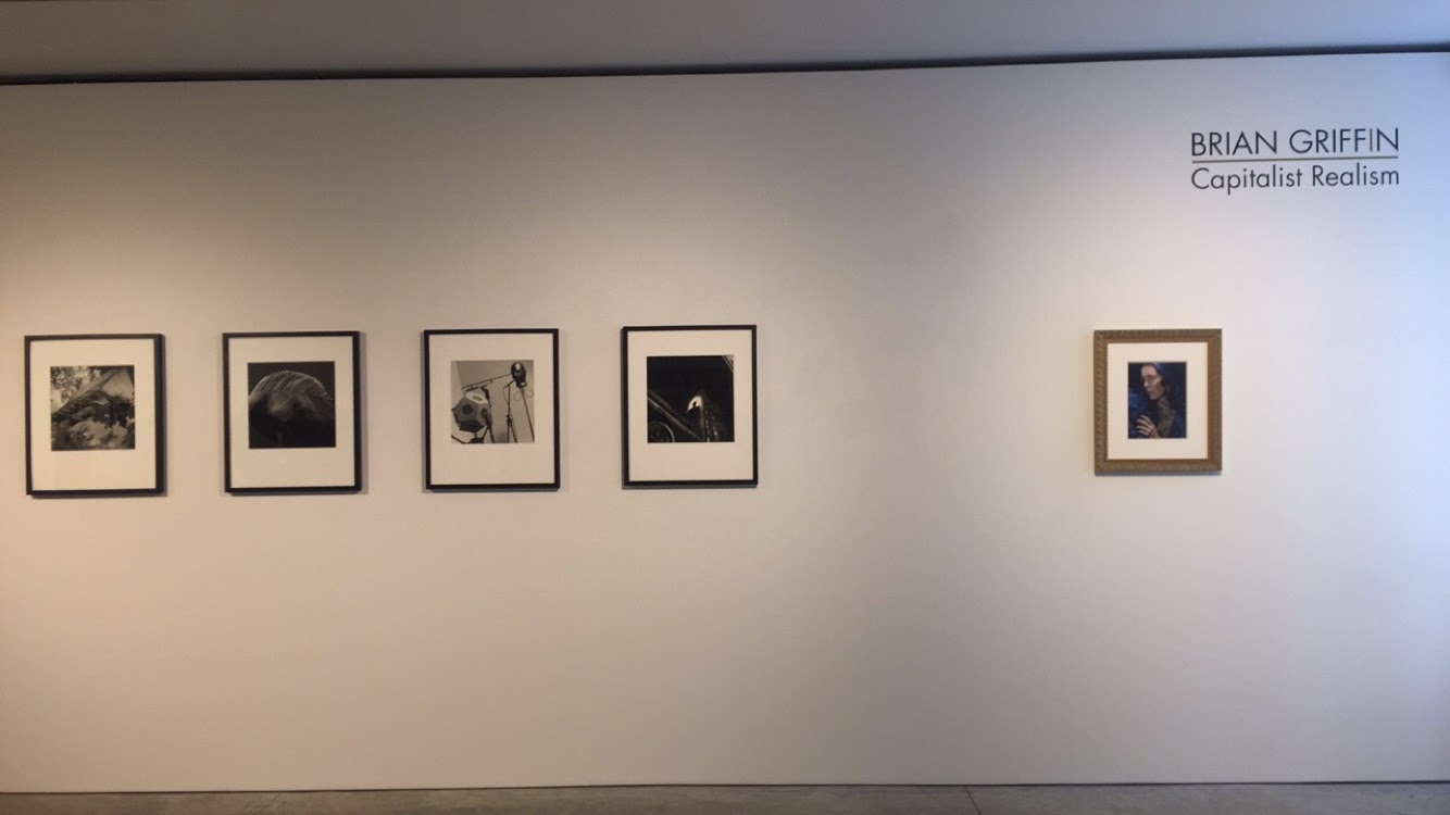
 Looking at Brian Griffins work in the Steven Kasher gallery also helped me to imagine how my work would sit side by side if framed and mounted, however I will definitely be printing much bigger. But he did get me thinking about spacial awareness and order of my photographs. 

Potential layouts for finals

1.

2.


Amaan


Found Amaan the most difficult to shoot. The shoot itself was organised very promptly as I had another model booked in that bailed so managed to find Amaan in enough time to go ahead with the shoot. After finding this image I feel better about the shoot but its not one of my favourites so far.

Abbas


50mm lens

Tried continuous light instead of flash this time as the aperture was so wide

F1.4 1/80

Really happy with this photography. Love the colour palette and the green compliments his eyes. Angle also helps to show his cheekbone and enhance definition in his face


Herb Ritts

Herb Ritts was an American Fashion and Portrait photographer who took most of his photos in black and white, with a unique touch. He positioned his models in the style of classical Greek sculpture.
The colour photos that he did produce were Vibrant, bold an gave a completely different style to his usual photography

His work was intriguing and prominent in the fields of fashion and style.


Looking back at older images has helped me see how certain trends have evolved and what is still good to include/ do when taking portraits. Again Ritts has also made me think about how I would get makeup applied to my models in order to blend well with the clothes and backdrop. As I will be shooting more females from now on I will be looking into this more. 

Vitor Shalam

With more than 10 years of experience, Vitor Shalom is the mastermind behind BLOW Mag and permanent photographer of the magazine. Based in São Paulo, he works for both national and international markets of advertisement and fashion.
On the European season, he also photographed in Switzerland, Portugal and Turkey, where he’s represented by the agency Workshot


Though visually these images don't bare much resemblance to my own work they have inspired me style wise and also given me other ideas with angles and poses to shoot my models. 

Portraiture - Richard Brilliant (Essays in Art and Culture)

This is a book I came across during my research about portraiture I was interested in the front cover which made me want to book it out and look further into it. The book covers the 20th Century including paintings, sculptures documents and photographs. He explores Western art and its changes in the nature of the individual society. Richard looks into the connections between the subject matter of the portraits and the viewers response. 
I found looking through this book quite useful as it made me think about paintings as well as photographs and how portraiture has evolved to fit a ever-changing society. 


Thomas Ruff


Thomas Ruff is a German photographer who is famous for his passport like portraits. His early portraits were black and white but he soon switched to colour. Using sold backgrounds in different colours the sitter was allowed to choose which colour served as the background. The resulting portraits depict the individual persons – often Ruff’s fellow students framed in a passport like photo. His images are typically shown with emotionless expressions, sometimes face on sometimes profile and infront of a plain background.


When Ruff began taking portraits he was aware of the era at the end 20th century. He saw how everything seemed bright and illuminated. It was an era of surveillance cameras and being watched all the time. His idea for the portraits was to use even light in combination with a large format camera, so that you could see everything about the sitters face. He also didn't want the sitters to show any emotion, he told them to look at the camera with self confidence. Ruff wanted his portraits to act as an official portrait of his generation. He wanted his photos to look like those in passports but without any other information. 
This type of portraiture has made me think about why I am taking my photographs and how I want to portray them as a series. As all my models are students and from different backgrounds I want to focus more of the diversity of my models compared to how models are supposed to look by societies standards. 


Further Influences - David Sims

Sims is a British Fashion photographer who first made his name in the 1990’s after working for magazines such as The Face and i-D.
Since he has also worked in advertising and created images for brands such as Alexander McQueen, Calvin Klein and Jil Sander.
Sims has held international exhibitions of his work in Tokyo, Switzerland and Hamburg. He also had a permanent collection of his work at London’s V&A and Tate Modern.


 Love the vibrance if the photographs. Though all shot for different campaigns I still think they go together well and has also given me more inspo for composition. I was also drawn to his photographs as I noticed similarly to my idea he has used models - male and female from different ethnicities. I think this makes his work stronger and makes me feel more confident about why I have chosen to use a diverse selection of people.